Cotton Puffs, Q-tips, Smoke and Mirrors: The Drawings of Ed Ruscha
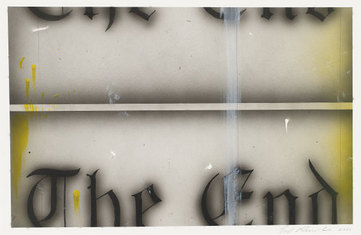
Ed Ruscha, The End #68, 2006
The Washington City Paper • March 11, 2005
By Jeffry Cudlin
Artists are supposed to destroy themselves—or at least that’s what Hollywood has taught us. Since 1956, when Kirk Douglas played a lantern-jawed van Gogh who blew his brains out after a perfectly productive day in the wheat fields, American movie studios have revered artists for their ruinous cathartic binges. In 1996, it was Jeffrey Wright as the young, doomed Basquiat. In 2000, it was Ed Harris in all his raging, balding glory as Pollock, drinking himself to collapse and trailing webs of slathered paint behind him. Never mind the art, kids; it’s all about the torment and outsized personalities.
Somehow, this outdated caricature of the artist maintains its power in the popular imagination, even in the face of a far more dominant art-world paradigm: the coolly detached professional, too much the smooth operator to consider offing himself before having at least one major museum retrospective. Sixty-seven-year-old Los Angelino Ed Ruscha is certainly a survivor of this type; his last museum retrospective in D.C., in fact, was less than five years ago. And rather than succumb to Hollywood stereotype, the artist has taken as one of his great subjects Hollywood itself, adapting the strategies and styles of cinema to the more traditional media of drawing and painting.
Indeed, Ruscha imparts a clarity and finish to his work befitting the slick staples of the multiplex. The National Gallery of Art’s “Cotton Puffs, Q-tips, Smoke and Mirrors,” show, which gathers together nearly 100 works on paper Ruscha made from 1959 to 2002, is named for some of the materials the artist uses to achieve this. The “smoke and mirrors” part, of course, is metaphorical. The cotton balls and swabs, however, are real—just some of the odd implements that Ruscha has used for the past four-and-a-half decades to carefully blend dry pigment on paper, producing a body of work that looks very nearly untouched by human hands.
Typical of Ruscha’s oeuvre is “Promise” (1967). In this piece, the word “promise” unfurls in the center of the page, rendered in curls of paper ribbon—or maybe unspooling toilet paper. Watery clouds of gray surround it, giving the text a ghostly glow. The appearance of the medium suggests watercolor, but Ruscha created his soft, half-toned grounds with blended gunpowder. Both the cleanly masked edges and the occasionally visible grain of the powder give this piece the look of a print rather than a drawing.
This example brings to mind Ruscha’s early admiration for the work of Jasper Johns: He liked that Johns’ paintings didn’t look like paintings. But rather than painting flags or targets, Ruscha made a name for himself in the ’60s and ’70s by rendering ostensibly random words and phrases in ersatz typefaces. These bits of text float in a shadowy, imaginative realm as unreal as the fictive spaces of cinema or commercial art, their aura of dislocation rivaling that of the Omaha, Neb.–born artist’s sprawling adopted hometown.
Early on, Ruscha chafed at the earnest abstract-expressionist leaning of his training at what would become the California Institute of the Arts. “Sweetwater” (1959) is a record of this early struggle: In the center of a yellowed, roughly 22-inch-by-17-inch piece of paper, a series of urgent dabs of viridian and cobalt-blue ink form staggered rows inside a ruled box; directly under it, “SWEETWATER” appears in a neat, serif’d typeface, printed onto the page by letterpress rather than drawn. Already, this is the most expressive freedom Ruscha could muster: a few sudden blotches no bigger than your fingernail. And already there is the tension between seeing and reading that would characterize so many later works; Ruscha regards this drawing as anecdotal, a representation of a memory of road signs he encountered in the town of Sweetwater, Tenn. Most viewers, however, will probably think the piece’s inscription is self-referential, a nod to its aqueous medium and Kool-Aid coloring.
Uninflected lines drawn with mechanical implements are what Ruscha turned out to be most comfortable with, and there are plenty of those in the few studies here for the artist’s best-known larger pieces. In “Standard Study” and “Standard Study #2,” both from 1962, a Standard Oil station zooms dramatically from the upper right to the lower left of the picture, rocketing away from the viewer into the distance. The background is reduced to a flat, triangular void. These pieces of architecture are removed from the world, clearly delineated against empty visual fields for maximum impact, floating like devotional images in mystical spaces. Sure, it’s a parodic, tongue-in-cheek sort of mysticism that presents a roadside convenience as the promised land (and vice versa). But the graphic forcefulness Ruscha lends his otherwise banal subject indicates a serious desire to transform or supplant the world of mere appearances. And these pieces are gorgeously forceful.
A clue as to why words offered Ruscha inroads into that transformation can be found in his renderings of small, directly observed objects. For “Ball Bearings, Egg” (1971), Ruscha drew, yes, an egg and five ball bearings floating mysteriously in his trademark gunpowder void. Hints of blue and green pastel were used to indicate the reflectivity of the ball bearings; all of the objects were drawn roughly to scale. “I found out that it is important for objects to be their actual size in my paintings,” Ruscha comments in one of the catalog essays. “If I do a painting of a pencil or magazine or fly or pills, I feel some sort of responsibility to paint them natural size—I get out the ruler.” Lettering, as it turns out, has no implicit scale as a real-world object, allowing Ruscha some freedom from the tyranny of his compulsions.
The artist sometimes gives his chosen phrases a poignantly visceral treatment. In “Dirty Baby” (1977), the clean edges of the upright block lettering have been smudged; the words waver against a uniformly black background, as if they were badly silk-screened onto a cheap T-shirt. In “Babycakes” (1971), the background is a sickening ocher-green field touched with a spot of bruised dark red; the titular word looks to be spelled out in crumpled scraps of toilet paper. Clearly, these particular groups of letters are valued not merely as objects but also for their possible associations, poetic or otherwise. His words hover ominously and seem to vibrate with a significance beyond themselves—though that significance is always left unexpressed or deliberately defused. For the viewer, it can be an exercise in intellectual tail-chasing.
Funnily enough, there’s something of the ab-exers here, after all—or at least of the Barnett Newman who wrote, “Original man, shouting his consonants, did so in yells of awe and anger at his tragic state, at his own self-awareness and at his own helplessness before the void.” Except that as much as Ruscha might regard his decontextualized words as first utterances—or at least pure representations—he never yells them. He has too much self-awareness for that, and the void doesn’t scare him in the least—remember, he lives in L.A., where real estate rushes into any available space and reality is routinely reinvented on a blank screen.
Ruscha finds another degree of remove—and more artistic success—in images borrowed from moving pictures. In “Divorce Must Sell” (1984), pale-brown and silvery-blue light filters through six panes of a window; the rest of the room is an expanse of uniform dark brown. The effect is cinematic, but it’s also art-historical: The color of this ghostly late-evening light recalls academic landscape paintings of the 19th century, in which the world appears viewed through smoked glass. “Brave Man’s Camera” (1996), by contrast, uses an old Bob Hope one-liner to express a relatively new artistic anxiety: The phrase “BRAVE MEN RUN IN MY FAMILY” floats over a blackly sinister, tripodded camera, an iconic image for the uselessness of drawing and painting. To represent, Ruscha is apparently saying, is to be a fool—or, at the very least, to be in the movies. (In other words, things could be worse.)
More purely from that medium is the film-noir window in blurred black and light gray that crops up in “Metro, Petro, Neuro, Psycho” (1989); the words themselves overlap one another in increasing point sizes in a range of primary colors and white, forming a coalescing progression of nonsense credits. Here, unreadability is literalized, and the piece is more powerful for it. In isolation, Ruscha’s words can seem inside-jokey, a hedge against his appearing too content with his craftsmanship—all that skill and polish, applied to a just few letters. In a jumble, the words seem tragic.
“Homeward Bound” (1986) shows the silhouette of a sailing ship heeling over against the horizon of a pitching sea—and instead of Ruscha’s usual commentary, two black rectangles hover in the foreground, looking like a censor’s strips or computer windows awaiting text entry. “The words I use are unimportant; their definitions are unimportant,” Ruscha insists, and we might believe him now that he’s replaced those words with these blank place holders. Similarly, “Bison Study #2” (1989) gives us another looming symbol of mythic America, with an added white rectangle for an absent caption. The result: We experience a literal loss of connection. Information is missing that should bring us closer to these emblematic but partly obscured images.
In the exhibition’s final room, the end of the show is heralded by several works from a recent series; each is, zanily enough, titled “The End.” Again we have a nod to film: “The End #20” (1997) is a pinched, curving rectangle suggesting the distortion of Ultra Panavision. The words “The End” are painted in red, fuzzed-out Gothic script; lines meant to indicate scratches and hairs run top to bottom like Newman’s zips, signifying not spirit but technical difficulties—a phrase that would make for the truly ultimate Ruscha piece. Here, something is certainly winding down, be it the artist’s career, cinema, or art history itself.
Art that tries to find some universal truth beyond the physical world is nothing new, of course. People have sought this sort of magic for thousands of years. But an art that both aims for transcendence and freely admits the impossibility of ever really finding it is a rather new development. In Ruscha’s world, the gods have fled the museum and the studio, yet the faithful apparently still remain, waiting for more magic—no matter how broken-down or disingenuous it might be. Whether the artist wants to sustain the illusion or simply can’t help it is the question—one that Ruscha, maddeningly, refuses to answer.
next | previous | main menu